Pitch 1
Brand guidelines
I started from our new brand guidelines and worked out how the colors, typography, and visual identity should carry into property marketing, including how hero photos are treated and how listing signs are laid out.
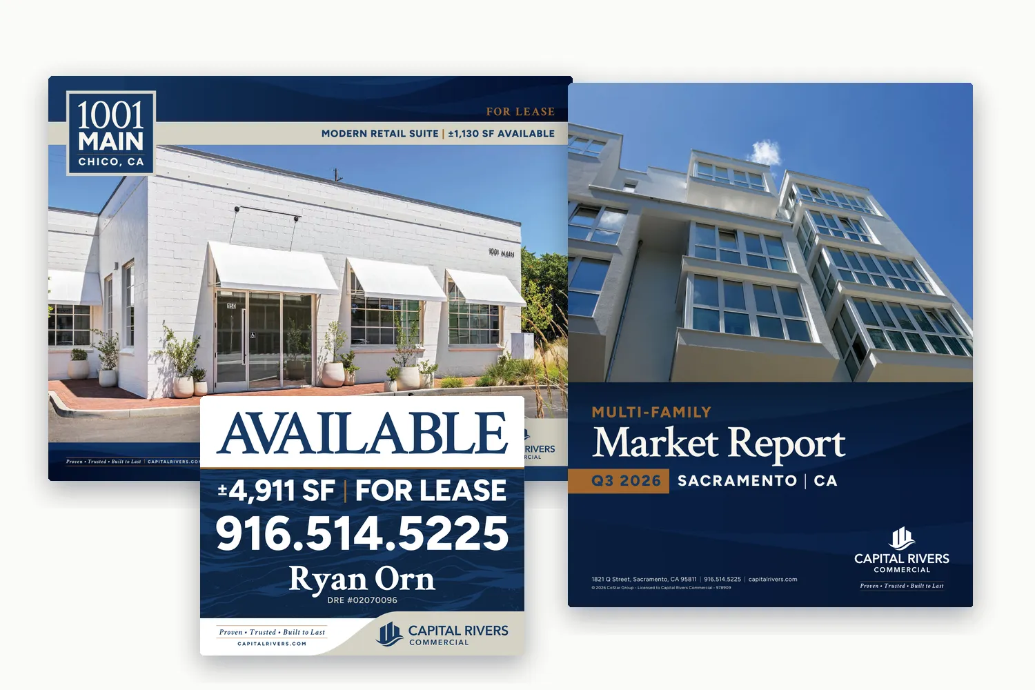
A flexible set of property marketing templates for Capital Rivers Commercial, covering brochures, listing signs, and quarterly market reports, built on the new brand and rolling out across the firm’s active listings.
The problem
A consistent set of property marketing on the new brand, flexible enough for any property type and easy to update for ongoing production.
I led the design direction, template development, and rollout, working with our graphic designer on production and with brokers on property details and approvals.
Pitch 1
I started from our new brand guidelines and worked out how the colors, typography, and visual identity should carry into property marketing, including how hero photos are treated and how listing signs are laid out.
Pitch 2
With this much existing material to replace, I built a Gantt chart in Excel to organize the rollout. It maps every deliverable with its owner and dates, from the first templates through the move of active brochures, emails, signage, and site plans to the new designs.
Pitch 3
I led the redesign of our property marketing: brochures, offering memorandums, listing signage, quarterly market reports, and digital listing graphics. Rather than just swapping in the new logo and colors, we used the redesign to improve the layouts and make every piece more consistent.
Listing signs follow the same system at every size, including large site signs and single-broker signs.
Pitch 4
I led the development of reusable layouts that adapt to different property types, whether it’s a retail suite, an office building, or a business for sale. Each template has set places for photography, maps, property details, and market data, so a new listing drops into a proven structure.
The same templates carry into social listing graphics for land, industrial, restaurant, and mixed-use properties.
Pitch 5
With the templates in place, our graphic designer and I began updating existing collateral and applying the new designs to incoming listings and campaigns.
I also led the redesign of our quarterly market reports. All 12 reports, covering retail, office, industrial, and multifamily across Sacramento, Chico, and Redding, now share one format.
Capital Rivers now has one consistent design system across its print and digital property marketing, with reusable templates for every new listing. The template rollout landed on schedule, and older brochures are being phased out naturally as listings turn over.
Property brochures and offering memorandums for lease and sale listings of every type
Listing signs in four standard sizes, for one broker or a whole team
Quarterly reports for retail, office, industrial, and multifamily in three markets
Social listing graphics and property email campaigns
A good template is consistent enough to feel like one brand and flexible enough to fit hundreds of different properties. On a rollout this size, the plan matters as much as the design.
Get in touch about a new brand, an upcoming campaign, or a role on your team. Tell me what you’re building.