All work
Single piece

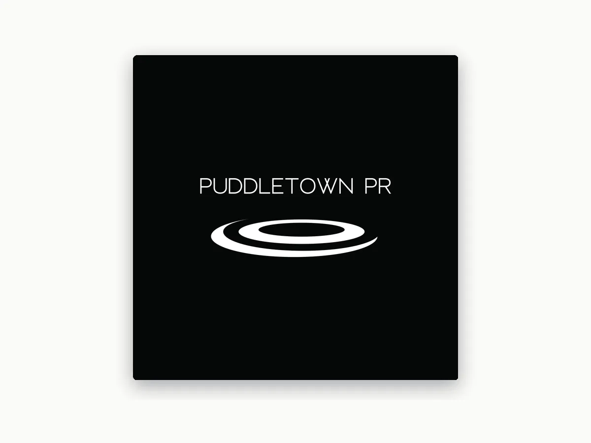
Puddletown PR logo

A modern logo for a Portland PR firm, built on a fresh take on the puddle in its name.

Role
Graphic designer
Client
Puddletown PR
Timeline
2 weeks
Tools
Adobe Illustrator
The Puddletown PR logo

The problem

Puddletown PR needed a modern, professional logo that played on the puddle in its name.

The goal

A distinctive logo with a modern take on puddle imagery that’s easy to recognize and remember.

My role

I developed the puddle mark and wordmark, then built a full set of logo variations in black and white.

Pitch 1

The puddle mark

The firm’s name comes from Puddletown, an old, tongue-in-cheek nickname for rainy Portland, so a puddle was the natural place to start. I modernized that idea in Illustrator: a few sweeping, offset rings that read as a ripple spreading across water, simple enough to recognize at a glance.

A light, open typeface keeps the wordmark clean and lets the mark do the talking.

The primary logo

Pitch 2

Logo variations

I built out vertical, horizontal, and condensed square versions in black and white, so the firm has the right fit for any space, like a website header or a social profile.

Horizontal
Condensed square

Results

Puddletown PR got a fresh, memorable mark and a logo system that fits any space.

Puddle mark

A modern ripple that ties the name to Portland

Three layouts

Vertical, horizontal, and condensed square

Black and white

Versions for both light and dark backgrounds

What I learned

When a name already suggests the image, the work is finding the simplest version of it. Stripping the puddle down to a few rings made it modern without losing the reference.

Have a project in mind?

Get in touch about a new brand, an upcoming campaign, or a role on your team. Tell me what you’re building.

emi.caulder@gmail.com