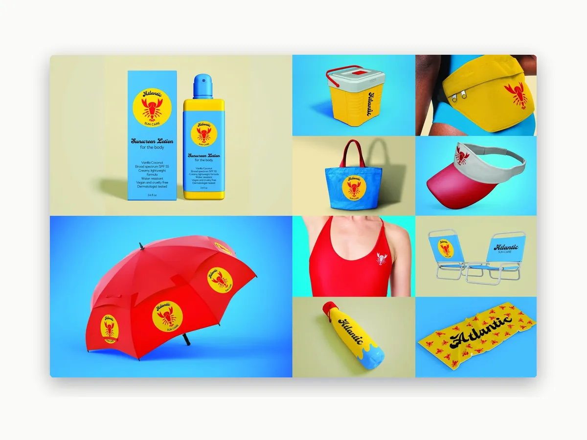
A bright, retro brand identity for a sun care concept, including the logo, packaging, and beach gear.
Role
Graphic designer
Project
Concept project
Timeline
3 weeks
Tools
Adobe Illustrator, Adobe Photoshop
The problem
Sun care brands tend to look clinical. Atlantic needed to feel like a day at the beach.
The goal
Develop a unique, recognizable company concept, logo, and brand identity.
My role
I created the concept and logo, designed the packaging and branded objects, and built the mockups in Photoshop.
Pitch 1
Concept and logo
I started from scratch with the concept: a beach-day sun care brand with a playful, retro feel. The logo puts a red lobster inside a yellow sun, a wink at what happens when you skip the sunscreen, with a bold script “Atlantic” wordmark above it.
A simple palette of sky blue, sun yellow, and lobster red carries through everything the brand touches.
The logo on a beach tote
Pitch 2
Packaging
I designed the flagship product, a body sunscreen lotion, with the logo front and center and the key details kept short and easy to scan.
Sunscreen lotion bottle and box
Pitch 3
Brand in the wild
To show the identity working beyond the bottle, I designed beach gear in the brand colors and built mockups in Photoshop. The lobster mark works on its own as a pattern or a small embroidered detail, and the script wordmark holds up at any size.
A complete, recognizable brand that looks at home on a bottle, a towel, or an umbrella.
Logo and wordmark
A lobster-in-the-sun mark and a bold script wordmark
Packaging
Sunscreen lotion bottle and box
Brand objects
Umbrella, towel, chairs, visor, and water bottle
What I learned
A bright, playful look still needs clear rules. Keeping to three colors and one mark made the brand easy to recognize on every product, whether it’s a bottle or a beach chair.